Design Settings
Design Settings is where you control how the booking calendar looks on your site. You can choose a theme, adjust colors, corner rounding, and a few other visual details.
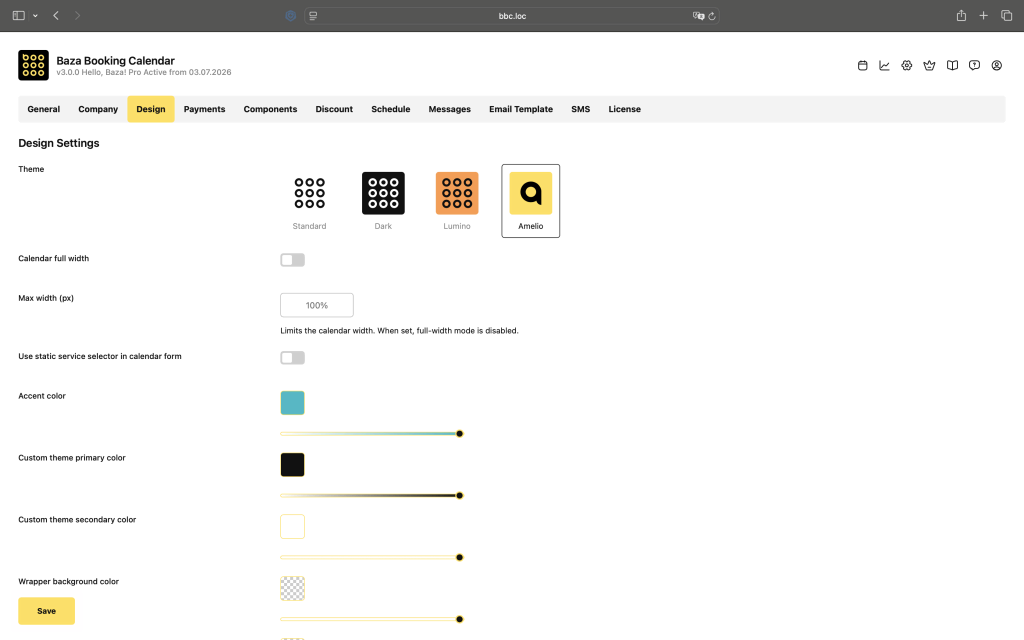
Theme
Choose one of the three built-in themes – Standard, Dark, or Lumino. The theme sets the base visual style of the calendar. Colors and other settings below can be customized on top of whichever theme you pick.
Calendar Full Width
Makes the calendar stretch to the full width of the container it’s placed in.
Use Static Service Selector
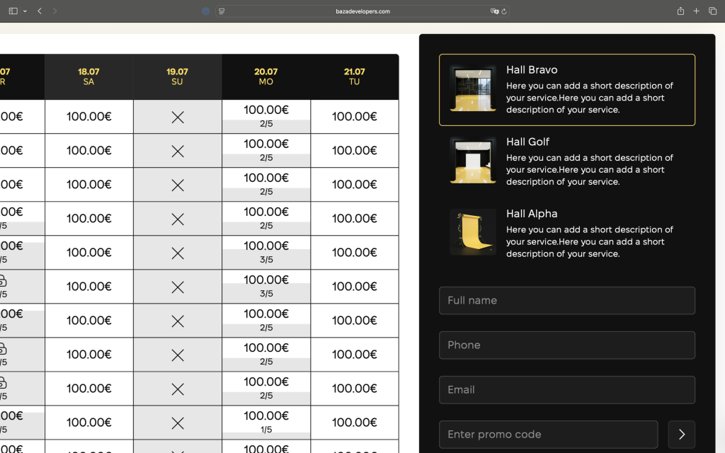
Changes the service selector in the booking form from a dropdown to a static list where all options are visible at once.
Colors
Custom theme color is the main accent color of the calendar. Custom theme primary color is used for interactive elements like buttons and selected slots. Custom theme secondary color complements the primary one and is typically used for the popup overlay background. Form background color sets the background of the booking form panel. You can reset all color fields to their theme defaults using the Reset color settings button at the bottom of the page.
Border Radius
Controls how rounded the corners are for the main calendar elements (0–40px), checkboxes (0–22px), and buttons (0–48px). At 0 the corners are sharp, higher values make them more rounded.
Notification Colors
Sets the background, border, and text color of the notification messages shown to the user during the booking process.
Popup Overlay
Enables a dark overlay behind the booking popup so the form stands out more clearly against the page content.
Additional Services Category Scroll
Enables horizontal scrolling for the additional services category tabs when there are too many to fit in one row.
Services Navigation Scroll
Enables scrolling in the services navigation when there are multiple services and they don’t all fit in the visible area.